
Why a nonprofit’s website is often where belief is built, or lost.
A nonprofit website has one job before any other: help a stranger understand what you do, who you serve, and what they can do about it. When it does that well, visitors stay, trust grows, and people act. When it doesn’t, they leave and never tell you why.
We’ve spent 25 years building brands and websites for purpose-driven organizations, and the website is where we see the gap between a strong mission and a strong first impression show up most. For most people, it’s the first place they go to learn about your mission, explore your programs, or figure out how to get involved. That first visit shapes everything that follows. Our work with Kids Beating Cancer and Mercy Chefs has shown us how much the right digital experience can matter, and here are the six things we keep in mind when we build for organizations like them.
1. Start with a clear message
When someone lands on your homepage, they shouldn’t have to hunt for what you do. Within seconds, a visitor should understand your mission, the people you serve, and how they can get involved. That doesn’t mean fitting your whole story onto one page. It means giving people enough to understand your purpose and a reason to keep exploring.
Clarity matters more for nonprofits than for most, because visitors arrive for different reasons. One person needs services, another wants to donate, and a third is looking for a way to volunteer. Clear messaging gives each of them somewhere to start without making them sort through everything else first.
2. Design for the people using it, not the people running it
It’s easy to build a website around what you want to say. The stronger approach starts with what visitors are looking for, and organizes information so they can find it without clicking through page after page.
The Kids Beating Cancer Villages page is a good example. The Villages chapter has a community of supporters who take part in fundraising events and volunteer opportunities all year. A dedicated page gives them one place to see upcoming events, meet the committee members, and find ways to get involved, instead of searching the full Kids Beating Cancer site for what applies to their local chapter. It’s a simple idea, and it makes the experience far more useful for the people on the other side of the screen.
3. Build trust into the experience
Before someone donates, volunteers, or reaches out, they want to feel confident about who they’re supporting, and your website carries much of that weight. Design helps, but trust goes further than how a site looks. Current information, consistent branding, real photos, and clear explanations of your work all shape how people see you.
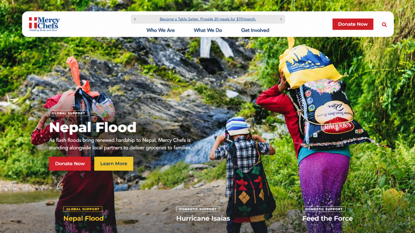
That’s the standard we’re holding to as we build a new website for Mercy Chefs, a nonprofit that provides professionally prepared meals to people affected by disasters, emergencies, and food insecurity. The site is still in development, but the goal is already clear: make the mission and programs easier to understand, and give the experience the same care Mercy Chefs brings to the work every day. When visitors can find what they need and see an organization represented clearly, they have more reason to take the next step.
4. Show people the difference you’re making
Nonprofits have stories that deserve to be heard, and websites often don’t carry them. Explaining your mission is one thing. Showing people what it looks like in action is what moves them. Photos, testimonials, impact numbers, and stories from the people you serve help visitors see the difference your organization makes.
For Kids Beating Cancer, community events are central to the mission, and the Villages page shows both the fundraising activities and the people who make them happen, so visitors see the community around the organization. Mercy Chefs has a story just as powerful. Its work reaches people during some of the most difficult moments of their lives, whether after a natural disaster or in the face of ongoing food insecurity, and as we build its new site, we’re looking at ways to make those different areas of impact easier to explore. The aim isn’t to overwhelm visitors with information. It’s to connect them with the people, stories, and results behind the mission.
5. Make getting involved easy
Once someone connects with your mission, the next step should be obvious. Whether that’s donating, volunteering, registering for an event, or reaching out to learn more, visitors need to know where to find it. On the Villages page, supporters can see upcoming events and use a volunteer sign-up form, which gives them a clear way to turn interest into involvement. We’re taking the same approach with Mercy Chefs, where donors, volunteers, and community partners are each looking for different information, and the new site is being built with all three in mind.
Small changes carry more weight than people expect. A clearly labeled button, a shorter form, or better navigation can decide whether someone follows through. The less time people spend figuring out how to help, the more time they spend helping.
6. Make sure it works for everyone
Think about how often you use a website on your phone: checking an event, filling out a form, finding a detail while you’re away from your desk. Your audience does the same. A site has to work on a phone, a tablet, and a desktop, with text that’s easy to read, buttons that are simple to use, and key information that’s easy to find. Accessibility belongs in that same conversation, because thoughtful design helps more people reach what they came for. Both matter for Mercy Chefs, which connects with supporters and communities in many different places. A website should make it easier for people to engage with your mission, not put obstacles in their way.
A website that works for your mission
Every organization needs something different, and we don’t believe there’s one right approach. A local chapter may need a place to promote events and connect with volunteers. A growing humanitarian organization may need a larger platform that helps people understand its programs and support its work. The details change, but the goal doesn’t: help people connect with the mission and see how they can be part of it.
That’s the standard we hold our work to, whether we’re improving a website that already exists or building a new one. A website shouldn’t just tell people what you do. It should help them understand why it matters and make it easy to join in.
If your website isn’t carrying your mission the way it should, let’s talk.